Designing the perfect cover photo for your OnlyFans account is like creating a personal billboard. It’s the first thing potential subscribers will see, and we all know how important a strong first impression is!
A visually appealing and professional banner can significantly boost your ability to attract new followers and convert them into loyal subscribers.
Surprisingly, many newcomers miss the mark by using hastily created and unprofessional banners, which leads to missed opportunities. You can avoid this common pitfall by following these essential tips for crafting the best OnlyFans cover photo.
Summary
How to Create The Perfect OnlyFans Banner that Converts!
- First Impressions: Your OnlyFans cover photo is like a personal billboard; a professional and appealing image can attract new subscribers.
- Cover Photo Basics: It’s the large image behind your profile picture, ideally sized at 1168 x 204 pixels for desktops and cropped to 414 x 180 pixels for mobile.
- Importance of a Good Cover Photo: A neat and eye-catching cover photo sets expectations and plays a crucial role in converting visitors into subscribers.
- Sales Funnel Impact: It’s your last visual chance to excite potential subscribers and encourage them to join.
- Branding Consistency: Keep a cohesive style across your cover photo and other visuals to strengthen your brand and build a loyal fanbase.
- Positive Vibes: A bright and inviting cover photo can create a cheerful atmosphere, encouraging repeat visits.
- Sneak Peek: Use your cover photo to give a preview of your exclusive content to entice potential subscribers.
- Technical Specs: Adhere to recommended dimensions and file formats (JPEG or PNG) to ensure your cover photo looks polished and professional.
- Avoid Text: Text on your banner can get covered by other profile elements, so keep it minimal or centrally located.
- Mobile Considerations: Design your banner with mobile cropping in mind; keep key elements in the center.
- Choosing the Perfect Photo:
- Reflect Your Niche: Your cover photo should clearly communicate your content theme.
- Show Your Face: Displaying your face builds trust and relatability.
- Quality Matters: Invest in good lighting and editing to create a high-quality cover photo.
- Personal Flair: Add unique graphics and colors that reflect your brand.
- Avoid Group Photos: Focus on solo shots to avoid confusion and keep the spotlight on you.
- Importance of Testing:
- A/B Testing: Test different cover photos to see which one performs better in attracting subscribers.
- Preview on Devices: Check how your cover photo looks on both desktop and mobile to ensure it’s appealing across platforms.
- Recommended Tools: Use tools like Canva for easy design, Adobe Photoshop for detailed edits, and Snapseed for mobile adjustments.
Understanding the OnlyFans Cover Photo
The cover photo on your OnlyFans profile, also known as the “banner photo,” is just as important as the cover images on platforms like Facebook, Reddit, or X. It’s the large image behind your profile picture that acts as a big welcome sign for visitors to your profile. This visual snapshot gives visitors an idea of what they can expect as subscribers.
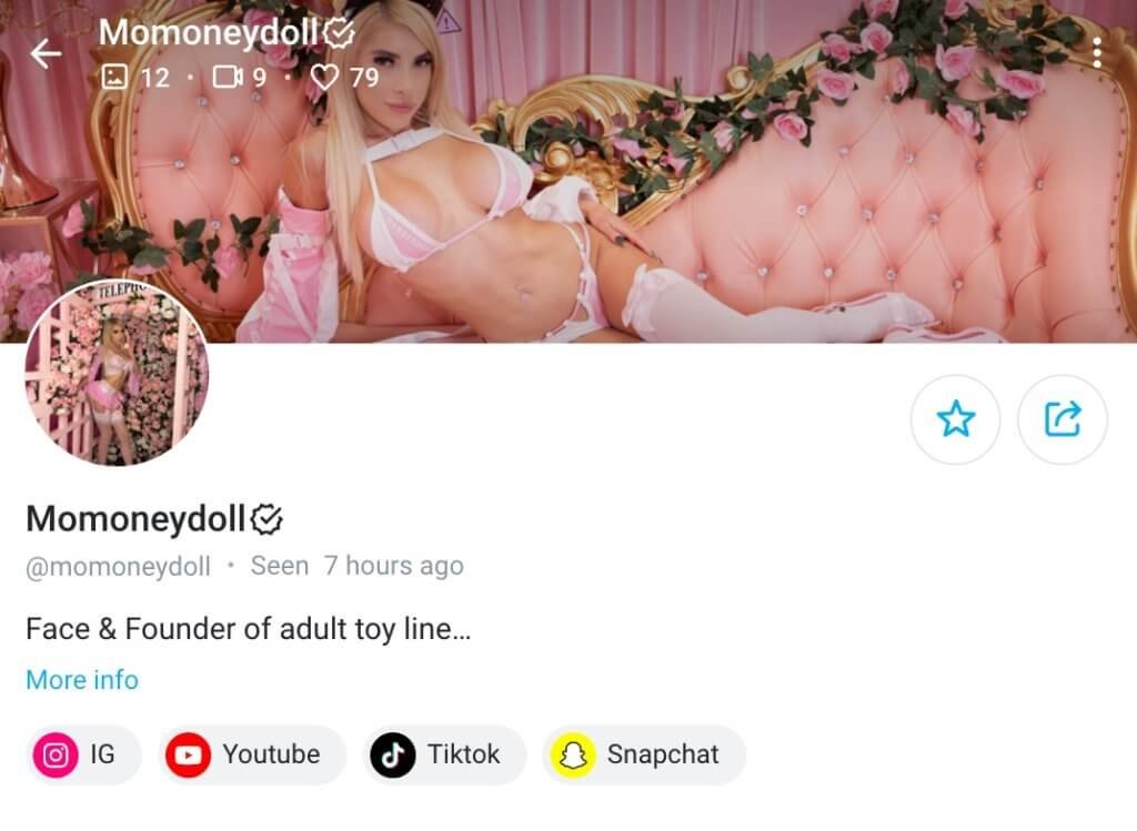
Your cover photo should be 1168 x 204 pixels in size. Getting these measurements right might seem like a hassle, but it’s worth the effort.
When done correctly, your cover photo can have a big impact and attract new subscribers to your fanbase. It can significantly influence your potential for success on the platform.
Why You Should Care About Your OnlyFans Banner
- Brand Identity: Your banner visually represents your brand, showcasing your unique style and theme.
- First Impressions: As the first visual element, an engaging banner captures attention and invites further exploration.
- Boost Subscriptions: Attractive, clear banners can convert visitors into subscribers by showcasing professionalism and appeal.
- Set Expectations: It previews what subscribers can expect, setting the right expectations for your content.
- Professionalism: A high-quality banner shows your dedication to top-notch content, boosting credibility.
- Memorability: Eye-catching banners make your profile memorable, encouraging fans to return.
- Enhances Aesthetic Appeal: A well-designed banner improves your profile’s overall look, making it more inviting.
- Communicates Value: Highlight special features or unique content to communicate the value you offer.
- Drives Engagement: An engaging banner sparks curiosity, driving visitors to explore and subscribe.
- Reflects Updates and Promotions: Use your banner to highlight updates, seasonal themes, or promotions, keeping your profile fresh.
Imagine that you are checking into a hotel for your vacation, you wouldn’t associate it with luxury if the front desk is unhelpful, the room is dimly lit with a strange odor, and the bed sheets are dirty.
Similarly, your OnlyFans cover photo plays a similar role for your profile—it’s the gateway to your content and sets the expectations for your potential subscribers.
An unappealing banner image might deter visitors from subscribing, making it essential to get this right to continually attract fans.
However, selecting a perfectly fitting image can be challenging. In this guide, we cover everything you need to know, including the ideal dimensions, file size, and format. You’ll also find examples of successful header images and access to free templates to help you create a standout banner.
First Impressions Matter
The cover photo on your OnlyFans page is the first thing visitors notice. If it looks messy or rushed, they may not see you as a top creator.
It’s like the front door to your business, setting the stage for what comes next and showing potential subscribers what they can expect.
Key Role in the Sales Funnel
Your cover photo is an important visual cue for potential subscribers before they decide to hit the subscribe button.
It’s your final opportunity to attract and excite them about the content behind the paywall.
Make it compelling and irresistible to convert casual visitors into paying fans.
Branding Consistency
It’s important to maintain a consistent style across your cover photo and other visuals. This not only makes your profile look professional, but also reinforces your brand identity.
When your appearance is cohesive across different platforms, people can easily recognize and remember you.
This is crucial for building a loyal fanbase as this consistency strengthens your OnlyFans brand, making it easier for fans to follow and engage with you.
Creating Positive Vibes
Many people use OnlyFans as a way to take a break from their daily routine and to enjoy positive and engaging content. A bright and inviting cover photo can create a cheerful atmosphere, making your profile a source of entertainment and joy.
This emotional connection can encourage subscribers to come back for more, building a sense of loyalty and anticipation.
Sneak Peek of What’s Inside
Potential followers are probably familiar with your social media content before they decide to subscribe. Use your cover photo to give them an idea of what they can expect once they join.
Highlight elements that showcase your unique selling points or hint at the exclusive content they’ll access.
This preview can make a difference in their decision to subscribe and offer a glimpse into the value you provide behind the scenes.
OnlyFans Cover Photo Specifications
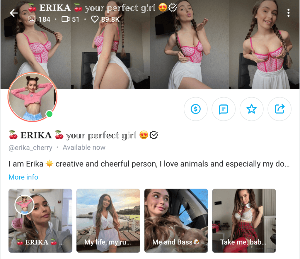
Before you start getting creative with your OnlyFans cover photo, it’s important to grasp the technical details. There’s nothing more frustrating than creating an amazing cover, only to find out it doesn’t fit properly or looks distorted when you upload it.
Let’s ensure you nail these specifications from the beginning so that your cover photo looks perfect on all devices.
Ideal Dimensions for OnlyFans Banners
For the best results on OnlyFans, aim for a banner size of 1168 x 204 pixels for desktop displays.
However, keep in mind that the banner is cropped to 414 x 180 pixels for mobile devices.
To accommodate this, place important elements in the middle 60% of your banner, leaving the edges for less crucial background details.
This means the most crucial elements should be positioned centrally to avoid any important details getting cut off.
You can also use our pre-made OnlyFans banner template here on Canva and replace the background photo with your actual photo. Don’t forget to remove the @YOURNAME and AVATAR section before downloading the final image. We put those sections for you there to understand that your content could get hidden by your stats and avatar on OnlyFans.

Adhering to these dimensions will help your cover photo look polished and professional, creating an excellent first impression for potential subscribers.
Best Aspect Ratio for OnlyFans Banners
Most OnlyFans users access the site from their phones, requiring your banner image to fit all devices with a single upload.
The recommended aspect ratio for your banner is 5.73:1. This ratio ensures that your banner looks good on both desktop and mobile devices.
Think of it like framing a photograph — keep the main focus in the center to maintain its visibility and impact.
Recommended File Formats for OnlyFans Banners
When choosing file formats for your OnlyFans banner, consider using JPEG or PNG for the best results.
Make sure your image is high resolution to prevent blurriness. You can use a high-quality image with a maximum file size of 10 MB, giving you plenty of room to create a crisp and professional look.
Avoid formats that may compress the image too much, as this can reduce its quality.
Considerations for Text on OnlyFans Banners
It’s generally best to avoid adding text to your OnlyFans banner.
The platform automatically overlays your username, brand name, and profile picture on top of the banner, which can obscure or crop out any additional text you include.
If you need to add text or a logo, place it in the central area to ensure it remains visible and doesn’t get covered by the profile elements or lost during mobile cropping.
Designing OnlyFans Banners for Mobile
The desktop banner size isn’t suitable for mobile due to the smaller screen, as it resizes to 414 x 180 pixels on mobile.
To ensure your banner looks great on all devices, follow these tips:
- Middle 60%: Place all important elements (text, key visuals) in the center 60% of your banner.
- Edges: Use the outer areas for less important background details, which can be cropped without losing key information.
By concentrating important content in the middle and keeping the edges simple, your banner will maintain its impact across both desktop and mobile views.
When creating your banner, always remember that it will be cropped differently on mobile devices, with the sides often cut off. To ensure your design works well on both desktop and mobile, keep key elements in the center.
Always preview your banner in both desktop and mobile views before finalizing it to ensure it looks good across all platforms.
By following these guidelines, you can create a cover photo that not only meets technical specifications but also makes a compelling and professional impression on potential subscribers.
OnlyFans Cover Photo Rules:
- Fit Your Niche: Choose a header photo that aligns with your niche. For example, if your content focuses on selling foot images, ensure the photo highlights your feet.
- Consistency with Branding: Your header image should match your overall branding. Use the same fonts and colors as on your other platforms to maintain a professional appearance.
- Avoid Unauthorized People: Unless you have a couples account, do not include other people’s pictures in your header. This violates OnlyFans’ Terms of Service and can impact your profile.
- Content Restrictions: OnlyFans prohibits cover images that show full nudity or violence. However, you can wear sexy lingerie or other suggestive outfits.
- Stock Images: Use stock images only if they are not copyrighted.
- No Watermarks or Copyrighted Material: Avoid using images with watermarks or any copyrighted content.
Tips for Choosing the Perfect OnlyFans Cover Photo
Now that we have covered the technical aspects, let’s dive into the exciting part: choosing a cover photo that not only grabs attention but also highlights your unique identity.
Here are some tips to help you create an eye-catching and effective cover photo for your OnlyFans profile.
Reflect Your Niche
Your cover photo should clearly communicate the theme of your OnlyFans page.
If you’re into cosplay niche, a striking costume or a portrayal of a popular character can make a strong impression.
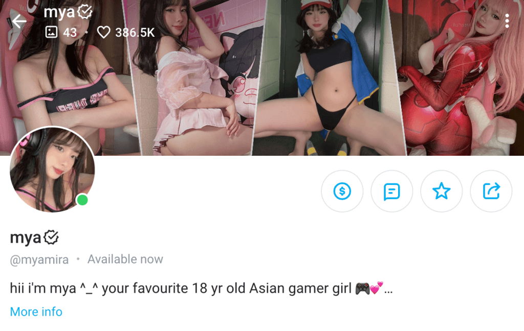
If you cater to a specific fetish or fantasy, incorporate related images or props to provide a glimpse of what subscribers can anticipate.
The aim is to ensure that potential fans instantly grasp your focus and feel compelled to discover more.
Showcase Your Face
Displaying your face in your cover photo builds trust and makes you more relatable unless you want to make money on OnlyFans without showing your face.
People want to connect with a real person, so a friendly smile or a confident expression can significantly enhance your appeal.
Authenticity is key—subscribers are more likely to follow someone they feel they can relate to and connect with on a personal level.
Prioritize Quality
Investing in a high-quality cover photo can set you apart from the competition.
If your budget permits, consider hiring a professional photographer who can capture your best angles and accurately represent your brand.
A professional can make a big difference in the final image quality and overall impression.
If hiring a photographer isn’t an option, don’t worry. You can still achieve excellent results using a good camera or even your smartphone, along with some editing tools. Experiment with filters, lighting adjustments, and retouching to enhance your shots.
Ensure your cover photo is vibrant, clear, and well-composed to make a lasting impression.
Add Personal Flair
Once you have a high-quality photo, add some personal touches to make it stand out. Consider incorporating unique graphics, bold colors, or elements that reflect your personality and niche.
These additions can make your profile memorable and help to establish your personal brand.
Ensure that your cover photo, profile picture, menu, bio, and other visual elements on your profile maintain a cohesive style.
For instance, if your cover photo features bright, bold colors, your profile picture should have similar tones to create a unified and professional appearance. This consistency enhances your profile’s visual appeal and increases the likelihood of converting visitors into subscribers.
Avoid Group Photos
Focus on solo shots for your OnlyFans cover photo. Group photos can be confusing for potential subscribers and detract from your individual presence.
If you’re an adult content creator, fans are looking to connect specifically with you.
Make sure you are the focal point of your cover photo, keeping others out of the frame to avoid any confusion or distraction that might deter new followers.
By following these tips, you’ll be well on your way to creating a captivating OnlyFans cover photo that not only attracts attention but also effectively communicates your brand and personal style.
Keep Testing & Updating
- Align with Content Changes: Update your banner when you introduce new content to signal fresh material is available for regulars.
- Sync with Marketing Efforts: Change your banner to reflect major promotions on platforms like Reddit. Use temporary banners to highlight promotions or special offers (e.g., “50% off today” or “free dick rating”).
- Follow Trends
Incorporate current trends or events relevant to your audience into your banners. Ensure trend-based banners align with your brand. - Seasonal Themes
Update your banner for holidays like Valentine’s Day, Halloween, or Christmas. Use festive designs to show your personality and engage fans in seasonal celebrations. - Celebrate Milestones: Mark follower milestones with special banners to celebrate growth and make long-term fans feel appreciated.
- Don’t Overdo It: Avoid changing your banner too frequently to prevent follower confusion. Aim for updates every 2-3 months, unless tied to specific promotions.
- Test and Optimize: Experiment with different banner styles and update frequencies. Analyze performance to refine your approach and find what works best for your brand.
A/B Testing
To determine which cover photo is the most effective at attracting subscribers, it’s crucial to perform A/B testing. This involves creating two different cover photos and testing them to see which one garners more engagement and subscriptions.
- Set Up the Test: Create two versions of your cover photo. Change only one element between the two (e.g., background color, image subject) to isolate the impact of that change.
- Run the Test: Upload each cover photo version at different times or for different user groups. Monitor the performance over a specific period.
- Track Performance: Use analytics tools to track key metrics such as page visits, click-through rates, and subscription conversions. Compare the data to see which cover photo performed better in attracting and converting subscribers.
- Make Data-Driven Decisions: Analyze the results to understand why one cover photo outperformed the other. Use these insights to make informed decisions on which cover photo to use and how to design future ones for maximum impact.
Preview on Devices
It’s essential to preview your cover photo on multiple devices to ensure it looks appealing on both desktop and mobile platforms.
- Preview on Desktop: View your OnlyFans profile on a desktop computer to see how the cover photo fits and looks at full size. Check for clarity and whether key elements are visible and centered.
- Preview on Mobile: Use a smartphone or tablet to view your profile. Note any cropping or changes in layout that might affect the visibility of important elements.
Recommended Tools for making OnlyFans Banner
Canva:
- A user-friendly design platform perfect for creating visually appealing cover photos with ease.
- Offers a wide variety of templates, graphics, and editing tools.
- Get started with Canva.
Adobe Photoshop:
- A powerful photo editing tool ideal for detailed adjustments and professional-quality edits.
- Provides a range of features for retouching, resizing, and enhancing images.
- Learn more about Adobe Photoshop.
Snapseed:
- A mobile app for photo editing, perfect for quick adjustments on the go.
- Features a range of tools for fine-tuning your images, including filters, cropping, and more.
- Download Snapseed for iOS and Android.
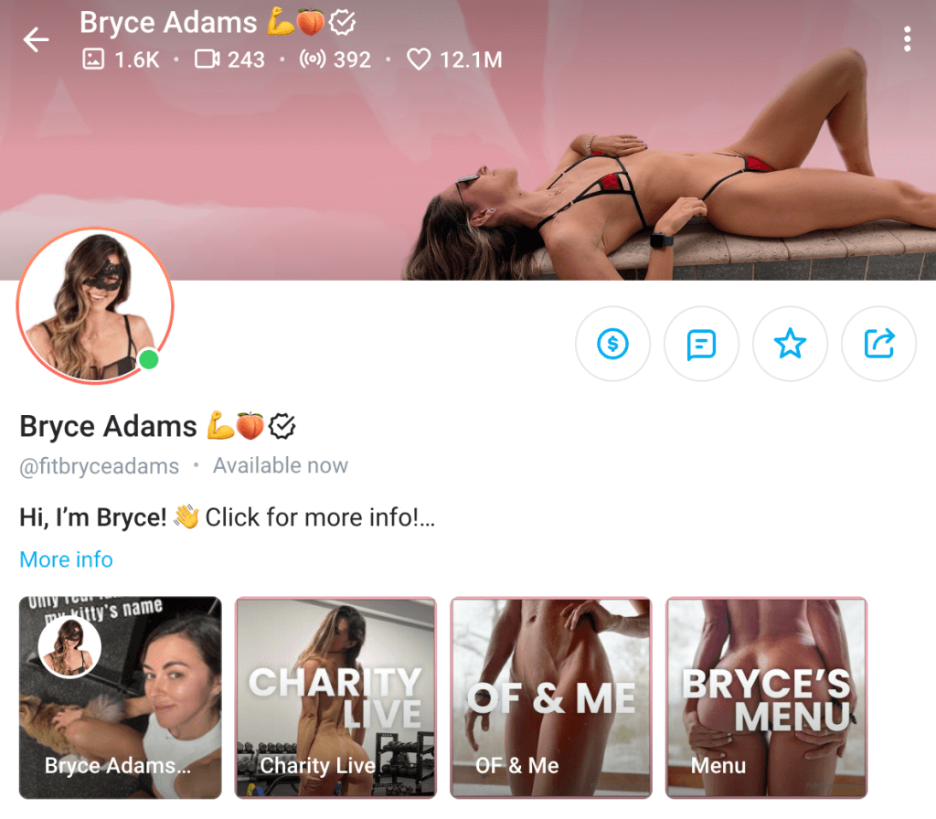
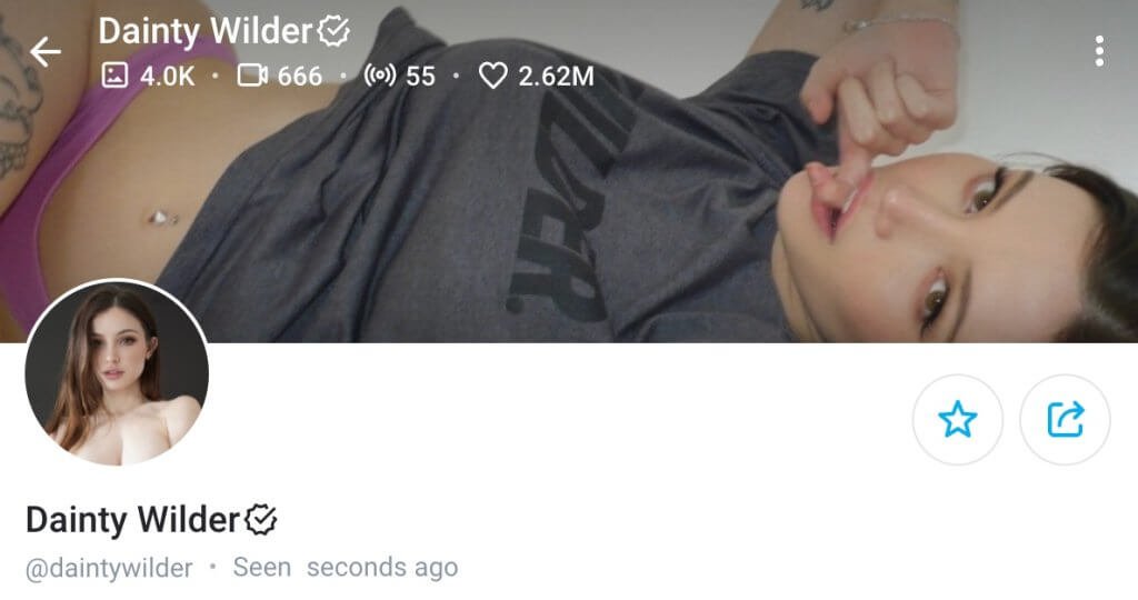
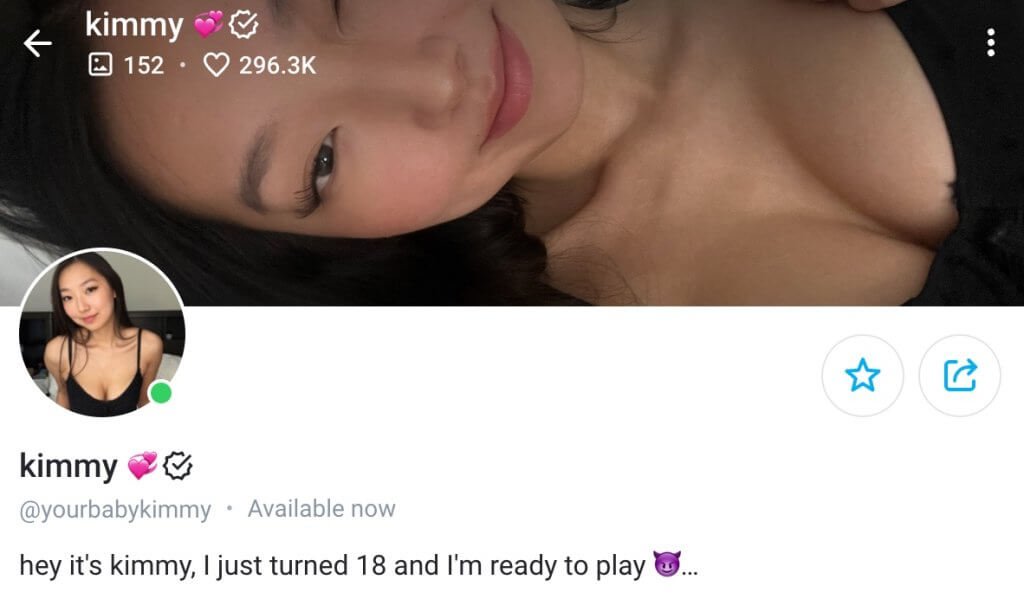
More Examples of Great OnlyFans Banner
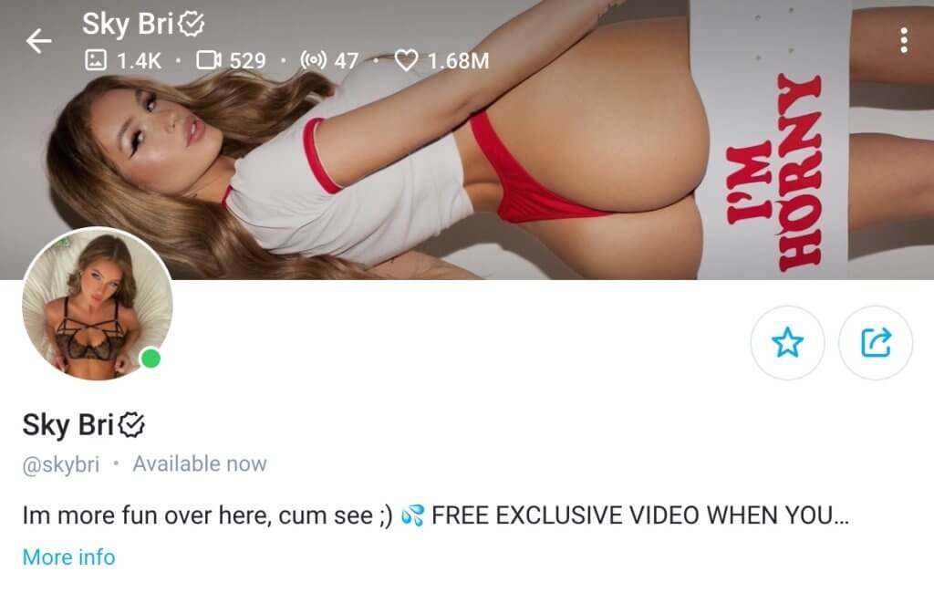

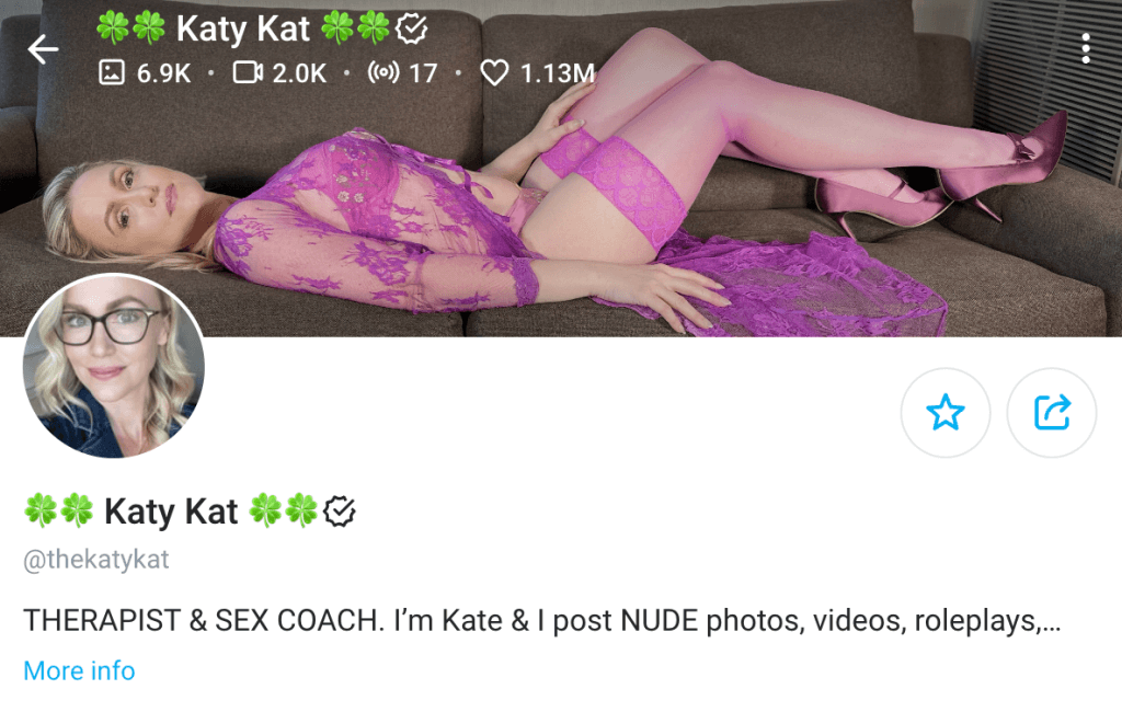
Some other exellent examples:
Conclusion
You don’t need the latest camera to create a captivating OnlyFans cover photo. Use what you have and focus on quality—clear images with good lighting that reflect your niche.
Consistency is key. Use similar images across social media to build a cohesive brand and avoid platform restrictions.
Remember, your profile and cover photos are your first impression. Make them count by ensuring they are clear, engaging, and true to your content.
